
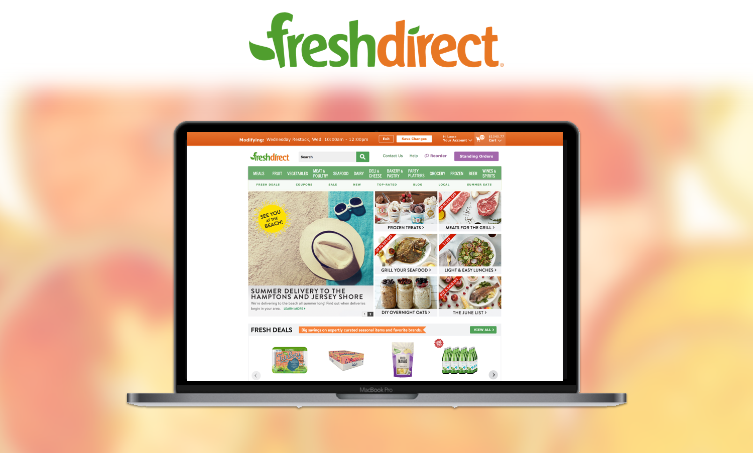
FreshDirect is the leading B2C + B2B online grocer in the Northeastern part of the U.S. and founded in NYC 20 years ago. It owns the entire supply chain and delivery experience which allows for lots of order customization options but also opens the door for an over-bloated, confusing user experience if features are not designed carefully.
The Problem
FreshDirect has built multiple unique features for its customers over the years, but never got past the MVP phase for most of them because...waterfall. Analytics from GA and an overload customer service complaints pointed to two features in particular as the biggest pain points that needed refinement due to large amounts of drop-off within the experience and lots of angry customers with high average order values.
The two most egregious offenders included:
Order Modification, a unique feature that allows any both residential and B2B to change any aspect of the order up to 24 hours before delivery. Used on web and native app.
Recurring Order, the ability for B2B customers to set up recurring order templates that are delivered at a preferred frequency with the ability to customize any individual delivery of a recurring order. Used only on desktop web.
The Goal
The goal was to build enhancements to how both our B2B and residential customers use our proprietary ordering features within FreshDirect’s existing storefront to increase speed and ease of development. That meant no brand new experiences. At a high level, within such constraints, our focus was to:
Eliminating drop-off in the order modification experience by identifying choke points in the user flow and designing to optimize areas where usability suffers.
Allow quicker saving features for modifications.
Evaluate and enhance how the standard shopping cart fails to accommodate B2B customers with recurring orders who modify their orders at a much higher frequency with much larger cart sizes than residential customers.
My Role
My involvement consisted of product strategy, user testing, and UX/UI design across all platforms. As designers, we worked together in a team of three building out various components of main user flows for order editing and management. I owned the shopping cart design and order modification design. The team also consisted of a Product Manager, Business Analyst, Engineering director, an additional designer, and front-end developer lead. The UX team was the owner of the project with other stakeholders being the VP of E-Commerce, VP of Application Development and the CEO.
Note - There were other aspects of this project designed by other team members not included in this case study.
The Outcome
Since this project’s completion, FreshDirect is on pace for an additional 650-700 modifications daily after these releases. If the pattern based on a month of tracking GA data holds true, then the company should gain seven figures in revenue (leaving out exact numbers obviously) from these enhancements by end of year. So far, there has been a sustained 42% increase on order modifications. There are several variables that can slow down this pattern such as natural demand going down, inventory issues etc. but either way I’m content with the end result of this project . However, to me there will always be a feeling of “what if” in regards to how we could have shaped the experience even further if we had more time to push this product vision further by exploring features such as “One-Click” global modification saving and an even faster recurring order creation flow.
NOTE: Data has been obfuscated for privacy reasons but the trend lines hold true.
The Process

Scopes and Constraints
The project was FOUR months-long in total, consisting of two phases:
Phase 1: Optimizing modification of orders
Lasted for four weeks of research and three weeks of design + testing.
Phase 2: Revamping Recurring Orders
Lasted for nine weeks of design + testing.
The ask was to build these enhancements within FreshDirect’s existing storefront to increase speed and ease of development because there were server and performance concerns over being able to load all of the store’s inventory from the backend ERP system at the time of modification, plus the cart of a specific user’s order and having them update in real time all in one template. I felt that it was disappointing to shelf the idea of having a simple, contained experience at the very onset of the project but was not in a position to influence a change at the time. This meant no brand new experiences and designing a solution that fits within the current CMS page templates.
NOTE: A freelance designer previously created blue sky concepts for the entire B2B shopping experience. We were asked to evaluate whether these concepts could translate to a new cart design and identify any gaps or usability issues.
Defining our Users
We started by setting up Hotjar to view modify tagged sessions and GA to tag all interactive elements to monitor drop-off. Due to the need to wait to collect quantitative data since tagging the site to track in GA was part of the project scope, we decided to conduct user interviews with B2B customers since they use both recurring order and modify order features at a high rate of frequency. We had heard from the B2B CX team that order management and modification were common points of frustration for office customers but we wanted to hear it from them.
Our goals were to identify behavioral contexts of ordering, the situational reasons for modifying and where the current experience failed to meet their fundamental needs. The feedback we received shaped our project plan. In speaking with five office who manage FD orders, some of the standout quotes included:
““When I try to modify it looks no different than when I place a regular order.””
““Modifying an order can be frustrating at times because I’m not always sure if I am editing the order or building a new cart.””
“I have a recurring order, but sometimes I don’t need things for a specific week like tea if nobody is drinking it. I gotta put the quantity at zero to not have it in the next shipment.”
“I like these features but I need to go back and forth constantly to add items, edit my order template and remove stuff from my weekly cart. I wish I could do everything in one place.”

We used these user interviews to come up with our primary user persona who fits the user type that modifies orders and places recurring orders
Using this insight along with leveraging past user interviews and survey feedback for residential customers, we began trying to empathize with all of the behavioral contexts as to one would modify their order in order to gain clarity on the scope of situations that would lead to modifications. This would help shape how we would triage the project and pick which areas of the site to focus on the most while building out these feature upgrades. Below is an example of how I tried to consolidate these contexts into one framework for shared understanding amongst the team.
Contextual bucketing for the different roles, scenarios and behaviors that would lead to the order modification process.
How we prioritized what to work on.
Once we analyzed the largest takeaways from interviewing users, we utilize the MoSCoW Method framework to define exactly what we needed to design and build versus other pieces of the Recurring Order and Modification flows that weren’t quite as important to moving the needle within the experience. As a group we voted on which features would be most important and bucketed the features into groups. Once we had our project and users defined, we were ready to begin building out concepts as a team and begin user testing.
Starting Design of the Experience

Outline of the prototypical modify flow and where chokepoints were in the experience based upon analytics due to poor mode identification, button copy and user understanding of navigating through modify mode.
While user research was done in one sweep for timing reasons, usability testing was broken into two separate phases. This is because while B2B customers use modification features often, it is a residential feature as well so it should be treated differently than Recurring Order features. We began by returning to auditing the relevant user flows for order modification and realized just how poor of a state the experience truly was in at the onset of the project. According to Google Analytics, 20% of users didn’t even complete their modification! After observing the core flow, it was obvious that the key CTA elements failed to correspond to the context of modifying and didn’t change when compared to outside of modify mode. We made a first pass at cleaning up these interactive elements by making the copy contextual to editing an order that was already placed and not centered around getting the user to check out.
Old snippet from PDF documenting issues with enter modify mode in the “MVP-ish” version of the feature. In this example the “View/Modify” link is one of the primary entry points of the modification process and had a double meaning! It was these early usability errors that hindered the experience so severely.
Comparison of button elements on the Recurring order page. Originally, the modify button was active even if you were already modifying the order and there was no way to exit from this page. You could also jump into modifying a different order while in “modify mode” which led to confusion. Just an example of our element cleanup process at the first phase of design.
Early, not so pretty, sketches of the Modify Mode header bar to indicate modification status.
To be honest, we knew this was a layup because of how severely out of context each call to action was within the flow. But we didn’t think we should be patting our backs for fixing the obvious. Instead we wanted to focus on the concept of locking users into a “mode” so there was no confusion upon which order they are editing. We designed and tested the order modification “bar” concept in the next phase, as a means of mode indication to improve wayfinding and user orientation with the modify flow, this was executed with the cleanup of interactive elements completed. Finally we tested these flow in mobile web version which lead to complications due to spacing. In total there were three phases of testing with two sets of 7-10 testers. Below were the biggest pain points.
User Testing Modify Mode
User testing log for measuring user’s understanding of button labelling and typical user flows when modifying an order.
Issues in user testing for Modification - entering modify mode, adding items, saving changes, noticing the “just added” indicator on product line items
Round 1 (16 testers)
70% of users thought the confirmation feedback wasn’t geared towards editing an order since it stated “Order Confirmed”. We changed most CTA elements within the flow but missed on the confirmation state. We updated this to “Changes Confirmed” in the next round.
40% of users didn’t point out the global modify bar unprompted. In the next round we made it sticky.
100% of users noticed the “Just Added” indicator on newly modified products so accounts with multiple users know when a new product is added.
Round 2 (16 testers)
In the mobile version of the flow, 40% of users though the “Cancel” link to leave modify mode meant cancelling the order rather than going back to the mode of standard shopping. We changed the Cancel CTA in the order bar to “Exit”, which we were not confident about at first.
20% First time users weren’t really sure that modify mode
Round 3 (14 testers)
86% task flow completion rate
86% expressed that the “Exit” CTA meant leaving the mode without saving their changes. One other tester guessed correctly. The plan was to roll with this label and monitor if there are any issues in analytics post-release.
Note: Having “Exit” as the main CTA to leave modify mode and cancel unsaved changes was due to mobile web and the native app not having room to spell out “Cancel Changes” and have a “Save” link.

Breakdown of modify bar final design based upon multiple rounds of user testing.
Screen flow of basic modify process for a first time “modifier” using the iOS app. This was the basic flow we used for user testing.
Designing and Testing Recurring Order
Once we were comfortable with the state of the order modification process, we focused our attention towards fixing the Recurring Order experience. One of our main goals with recurring order was to make the process easier for users when modifying to the point where they can perform all of the core tasks that they expressed in user interviews from either the cart page of the order settings page. In the current experience, you would have to jump back and forth depending on the task and neither page made it easy on the user to complete tasks. Concurrently, we also focused on making the order creation experience much easier with less steps in the frontend of the flow. However, I did not design that sequence so it will not be outlined in this case study.
Early wireframe design for the new cart page for Recurring Order feature.
We began by taking user feedback regarding how they view their recurring order as a rough guess rather than a true weekly order due to how often they need to change products each individual delivery. Instead of adding zeros in quantity boxes, we wanted to make it easy for users by adding links in line items that allow users to perform a variety of relevant actions. We also sectioned the cart in “One-Time Additions” and “Recurring Items” for easy distinction between the two since they have separate functionality. We spent two weeks working on design concepts as wires or low/mid fidelity UI and rounded out the experience into full mocks for user testing although they were not final UI designs.
Issues in user testing for Recurring Order - How to remove a recurring order item (Asian Pears) from only their next shipment, add item to delivery, change recurring template quantity of item, save changes.
Round 1 (14 testers) - Tested the basic design concept
20% of users fully understood how to remove an item in B2B modification mode for one delivery because they felt “Delete” as a CTA meant permanent - this was a MAJOR ISSUE
86% of users understood context of “Skip Delivery” link
50% of users missed the recurring item checkbox on product card
Round 2 (10 testers) - Tested iterations based upon feedback of the first round
88% of users were able to correctly assume the meaning of “default” quantity relating to editing the master recurring order template
93% understood how to move items between One-Time and Recurring Order sections without latency.
Example of creating feature parity on Recurring Order cart and settings pages for optimized workflow and less jumping between pages.
Shows the unique attributes of the Recurring Cart header
Outlining the unique features of the cart line items sections along with layout.
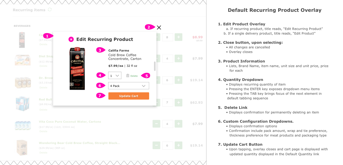
Outlines design decisions made for default quantity overlay from the Recurring Cart page.
Outlining Content Hierarchy
While designing this feature, we paid a lot of attention to hierarchy. While the cart page began with a header which is conventional, we wanted to make sure that we vertically stacked the different modification sections adequately based upon what needs the most attention. Going back to our initial user interviews, I noticed all of our subjects seemed to hone in on changing around their orders to add ad hoc products for a single week. This made me understand the importance of showing one-time items first because recurring items are essentially on “auto-pilot”.
Finally, we decided to stick the skipped items section at the bottom because we wanted those items to be “out of sight, out of mind”. If a user needed to add a skipped item back to an order, testing proved out that scrolling wouldn’t be as big of an issue as we initially feared because...well...users scroll. Also we tried to line the spacing of the design layout so that in most viewports line items would get cut-off by the bottom of the viewport, with the hope that it would encourage scrolling. However, in a feature as dynamic as a shopping cart it is hard to say if that will hold true.
Below is an example of the final UI design of the cart page with all sections exposed. It is important to note that there are variations where sections such as one-time additions do not exist. On a regular order, there would be no section headers, just a “Your Cart” header and line items stacked together.
Final UI design for the B2B cart page when a user has a standing order with recurring items, one-time items and skipped items.
Specifications outlining different cart sections. Multiple Wines & Spirit sections stacked are a legal requirement and not a UX design in case you were wondering.
Rounding it out
Once our usability testing proved out that the designs were in an acceptable place (all major flows hitting over 85% completion percentage). The last leg of the project consisted of writing out functional specifications for developers and QA testers in Indesign. It is here where we create wireframes and dig deep into the granular aspects of the interaction design, user states and accessibility design. This includes providing specs on how screen readers should tab through and read out the elements on a given page via alt-text descriptions in out html.
Functional specs for editing “master” default quantity overlay off of the Recurring order cart.
An example of accessibility specification writing for the cart page. Indicates TAB order and what a screen reader would read out for each section of the page.
Takeaways and Reflections
This project was an interesting test in patience since we had to break it up into two phases. Overall the expected extra $2 million dollars in revenue based on current projections on order modifications prove out that we definitely solved a problem for users. However, I feel like there is so much more that could have been done and it is hard for me to feel “proud” considering my gut is telling me that we have only scratched the surface. Projects having timelines is part of the deal, but there is definitely an inner urge to push this feature much, much further.
We are still rounding out the building phase of Recurring Order and I’m excited to learn more about the type of feedback we get from users. Since B2B percentage-wise has a massive effect on the company’s revenue, we have direct lines of communication which will definitely be utilized during rollout. I’m excited to have that level of direct communication with users since that is rare in product design and development.